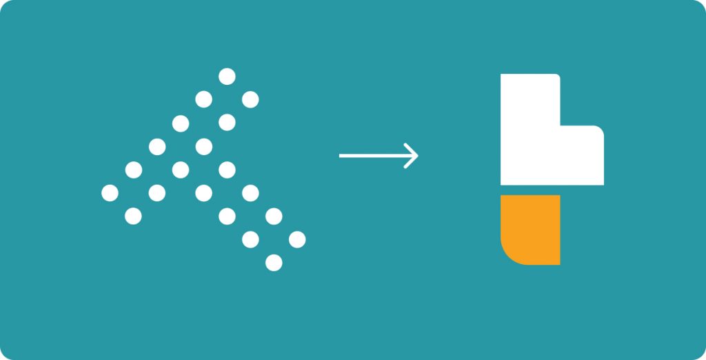
From
Dots
to
Blocks.

For some years now, we are being identified as the brand with 20 red dots forming a letter “T”, with the name TORILO written beneath it. In the mid of 2021, we completed the rebranding process of Torilo company limited.
We started in 2012 as a Data Company in the United Kingdom before setting up operations in Nigeria in 2016 with the purpose of tackling business and learning challenges.
We want to let you know why we did and how we did this. Enjoy our rebranding story, the story of our once upon a time 20 red dot company.
Why?
What Changed?

We kept the name but changed our visual identity. Keeping it simple, we adopted the minimalistic approach to the design. We had grown, and we wanted one design that will touch and connect to the products and solutions we create.
The
Logo
The logo has a significant letter “t” in it. The inspiration behind its shape is the mission to simplify, optimise, and grow businesses or processes. While looking for what defines or symbolises building and growth, our design team explored various options, from vectors to symbols. Looking inward and thinking of the growth of a child, the “building blocks” of the kindergarten, as well as the electronic game kids played while growing up, “Tetris” was the winner.
The curved edges show our balance and flexibility, our open-mindedness and empathy.
The Colour
We chose toruoise as our primary color because it is sophisticated and creates the balance we envision. The yellow color accentuates our brand and we infuse it in the design of other products and subsidiaries of the Torilo group.

Moving Forward
This rebranding has been simmering in the background for quite some time. Not just talking about it as a possibility (which was close to two years), but actually creating the new brand. We’ve been working quietly alongside our other projects. Putting everything in place to complete a completely new brand, which we can now share with you.
Join us as we continue this journey to building…